WizEdOS
A redesign for the WizEdOS platform
Project Type:
Client Work (WizRobotics)
Timeline:
2 weeks
Tools & Skills:
Figma
Jitter
Webflow
Team:
Web Designer (My role)
Context
WizEdOS had a problem- their website failed to communicate the value of their service.
During my time at WizRobotics, I had the opportunity to create a new direction for WizEdOS, an all-in-one learning platform for STEM educators. Initially, when discussing the project's scope, the client believed that only a simple visual refresh with a few minor website edits was needed. However, after analyzing the site and discussing long-term goals for the service, it became clear that there was a major disconnect between the existing design and the changes truly necessary.
Initial Notes
So, what were the issues with the old WizEdOS system?
After reviewing the initial website with the client, these were the main pain points that emerged:
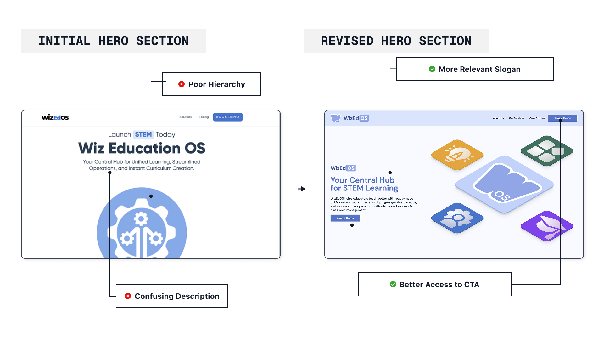
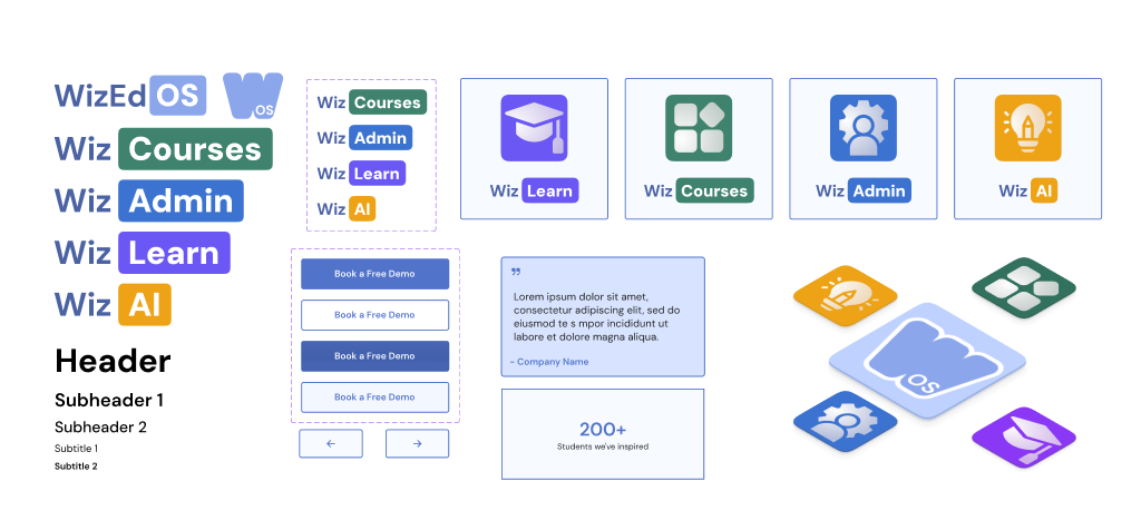
Inconsistent Branding
Many images on the website were random stock illustrations that failed to communicate the company's services. As a result, the site felt disjointed and gave off an unprofessional impression.
Confusing Page Setup
Important sections such as the booking form were placed in hard-to-access areas, making it difficult for users to locate key actions quickly.
With a clear understanding of what needed improvement, I began the research and development phase.
Creating the Flows
Treat the website layout like a conversation
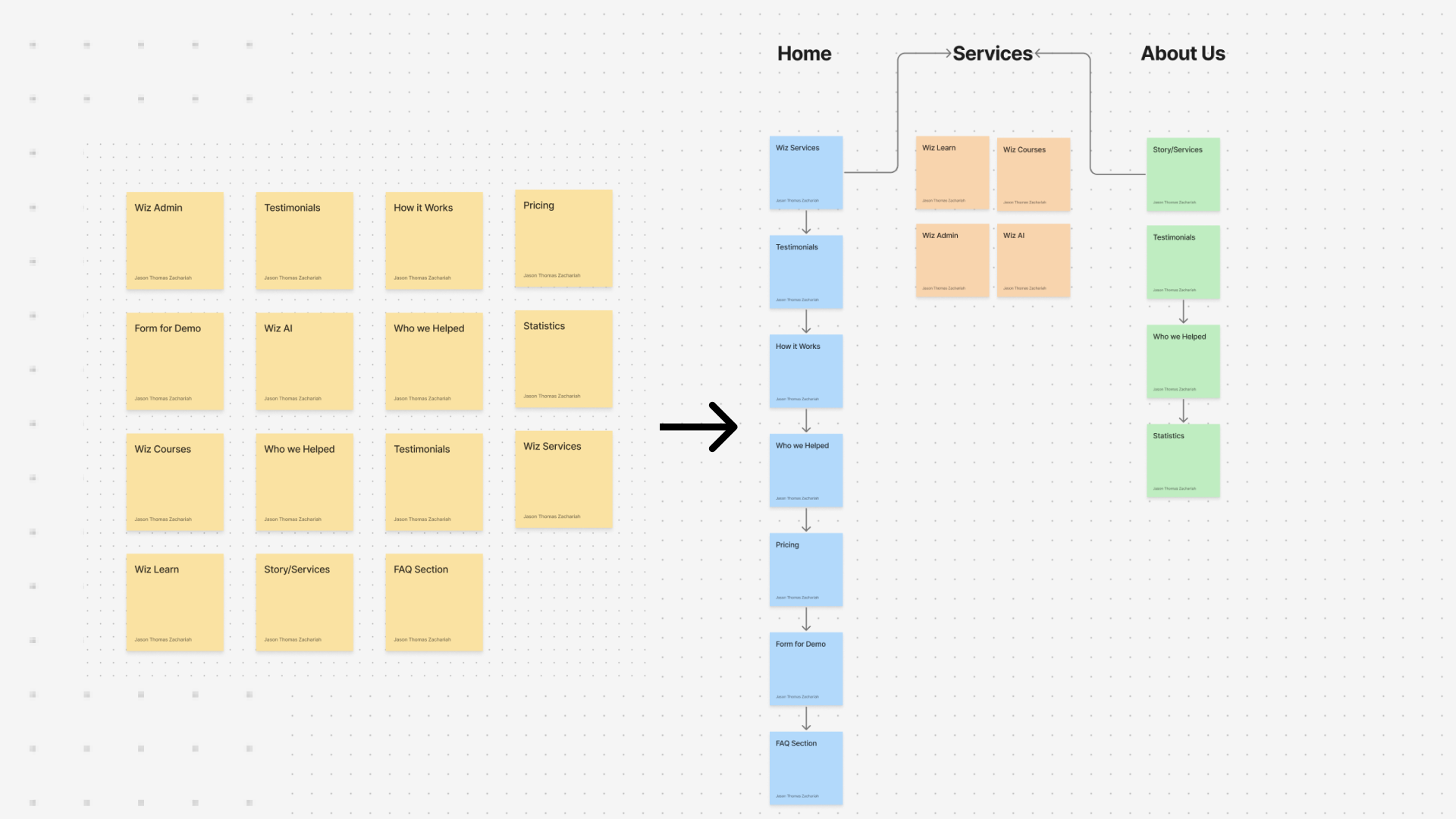
To get a clearer idea of how to structure the website that would satisfy the client, I had them "pitch" me the WizEdOS service as if I were another business . Using this method, I was able to identify natural ways to group content, taking notes on major points and structuring them based on how the client explained the platform.
This process allowed us to find what aspects of the website needed to be added, and how we should organize them by pages.
From this, we identified two main user flows for the WizEdOS website: to encourage companies to book a meeting, and second, to showcase the four sub-services of WizEdOS.
For the first flow, this was achieved by adding a CTA button in both the hero section and the navigation bar. This opened a pop-up modal, allowing users to access the booking flow easily without it disrupting the users flow like it did before
Reflection
1. Work with your client, not against them
Maintaining transparency and involving the client in design decisions helped minimize revisions later and ensured we were aligned on the final deliverables.
2. Seeing the Big Picture
Adapting the existing brand identity to a flexible design system helped create a cohesive and consistent brand. This helped the client understand the value of the design system and how it would benefit the company in the long run.