DESNbook
Concept for an all-in-one dashboard that allows design students to plan their degrees.
Project Type:
Personal Project
Timeline:
9 weeks (April-June 2025)
Tools & Skills:
Figma
Jitter
User Research
User Testing
Team:
1 Designer (My role)
Context
Planning out courses for the DESN program is a hassle, leading to students to feel frustrated and overwhelmed when planning their degrees.
As a design student in the DESN program, one area I dreaded was planning my courses - especially in my first year. The DESN Program is a 120-credit program that requires students to plan out their courses to fit the requirements. However, the resources used to help students require students to reference multiple sources of information.
"I had to pick my 2nd year courses and having to map out my picks for the next 2 years over and over by hand to make sure I wasn't missing anything..."
-DESN Student, when asked about course planning challenges.
Initial Research
To understand the pain points of degree planning, I surveyed 15 current DESN students.
This helped me understand their experiences when planning their degrees. I asked a mix of qualitative and quantitative questions to pinpoint what made course planning difficult.
Based on these interviews, here are the major pain points identified:
25%
rely on third-party tools (Notion, Excel, etc.)
53%
had trouble keeping track of course requirements
46%
wished for more support when planning their degree.
HMW STATEMENT
How do we make the process of planning out DESN student requirements a simplified, single experience?
Confusion over course requirements
The current design handbook lacks support for showing how courses affect degree, leaving students lost when planning their degrees.
Planning your degree is tedious
The current process requires students to use multiple disconnected platforms to follow degree requirements, leading to a workflow prone to errors
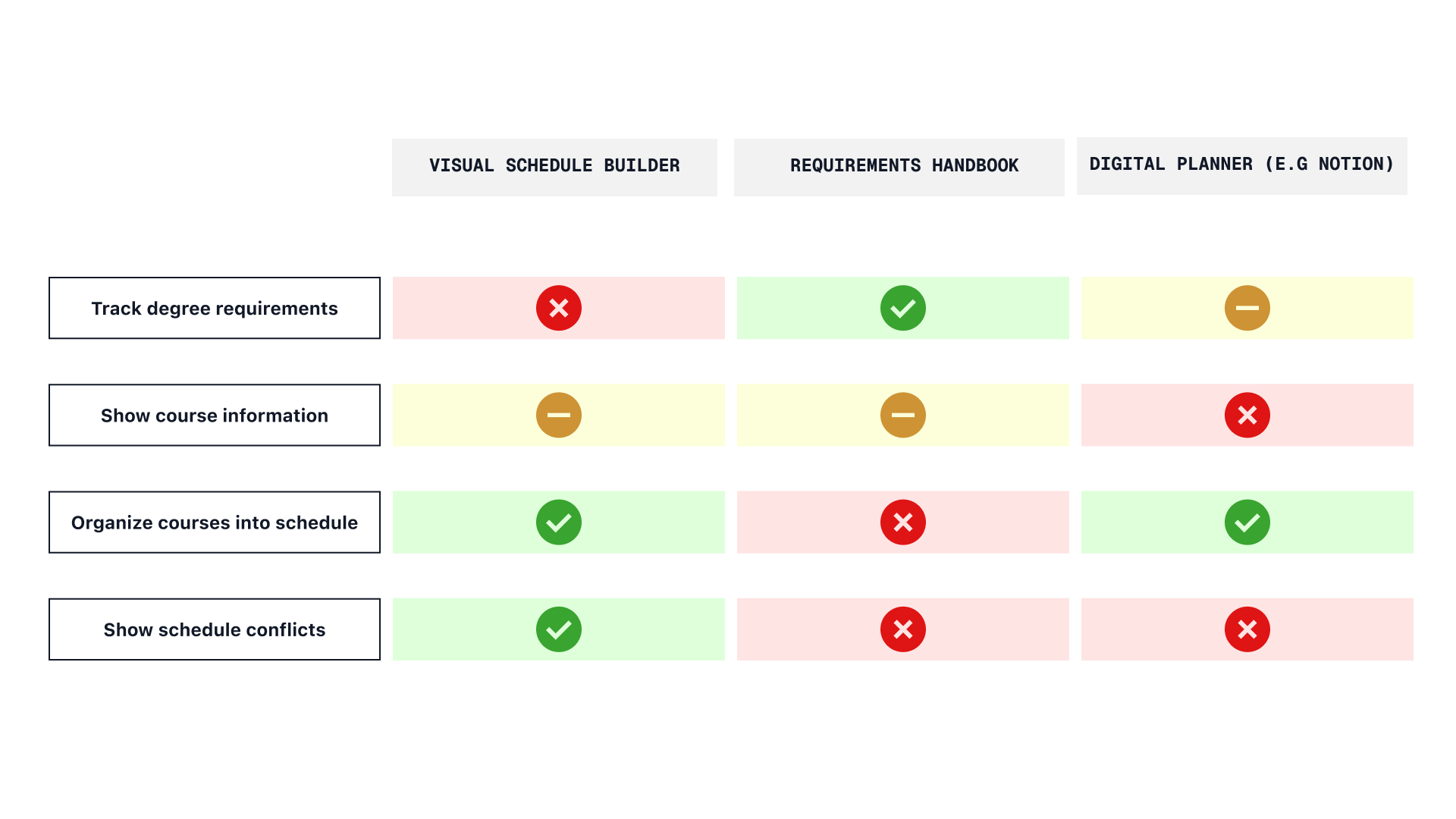
Competitor Analysis
I analyzed the three most common tools design students use to plan their degrees, focusing on their strengths and weaknesses. While each app had one or two strong core features, none supported the full journey needed. This reinforced survey feedback about the frustration of switching between multiple platforms.
Solution
One dashboard for all your course planning needs
A live digital planner that tracks DESN requirements, allowing students to manage course planning, view potential schedules, and address any issues in one place.
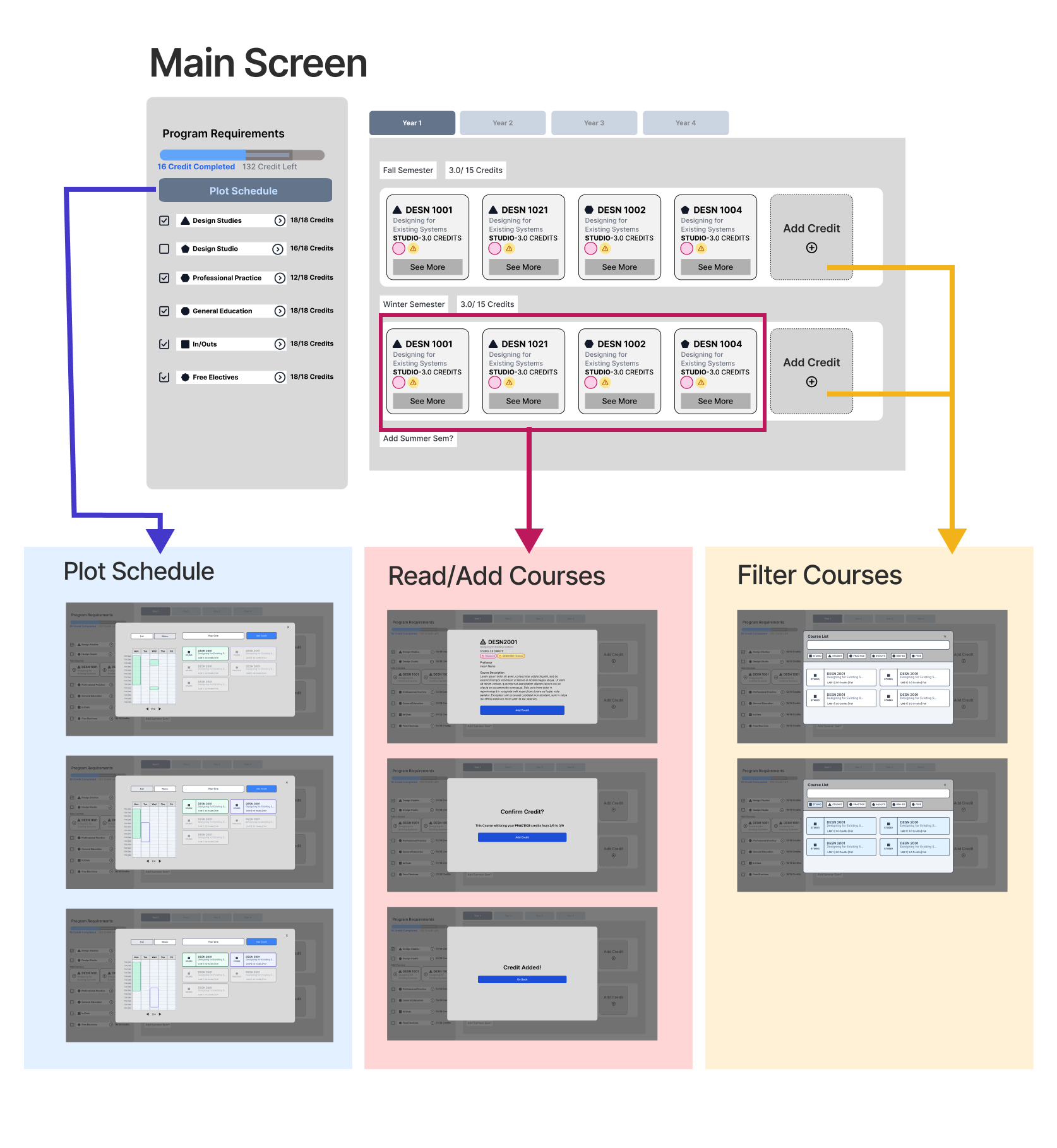
Final Product
Clearer Course Requirements
An organized way to view course requirements, as well as how they affect your degree progress.
Adaptive Schedule Builder
Allows users to visualize potential schedules, with simple toggle buttons to add/remove courses from their timetable.
Resolve course issues with one click.
Instead of manually figuring out issues within course, DESNbook displays, as well as offer solutions to correct, scheduling errors or conflict in your schedule, conveniently in the sidebar of the dashboard
Ideation Process
Re-evaluating the User Journey
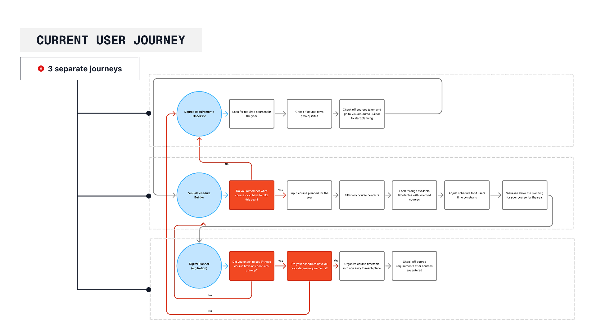
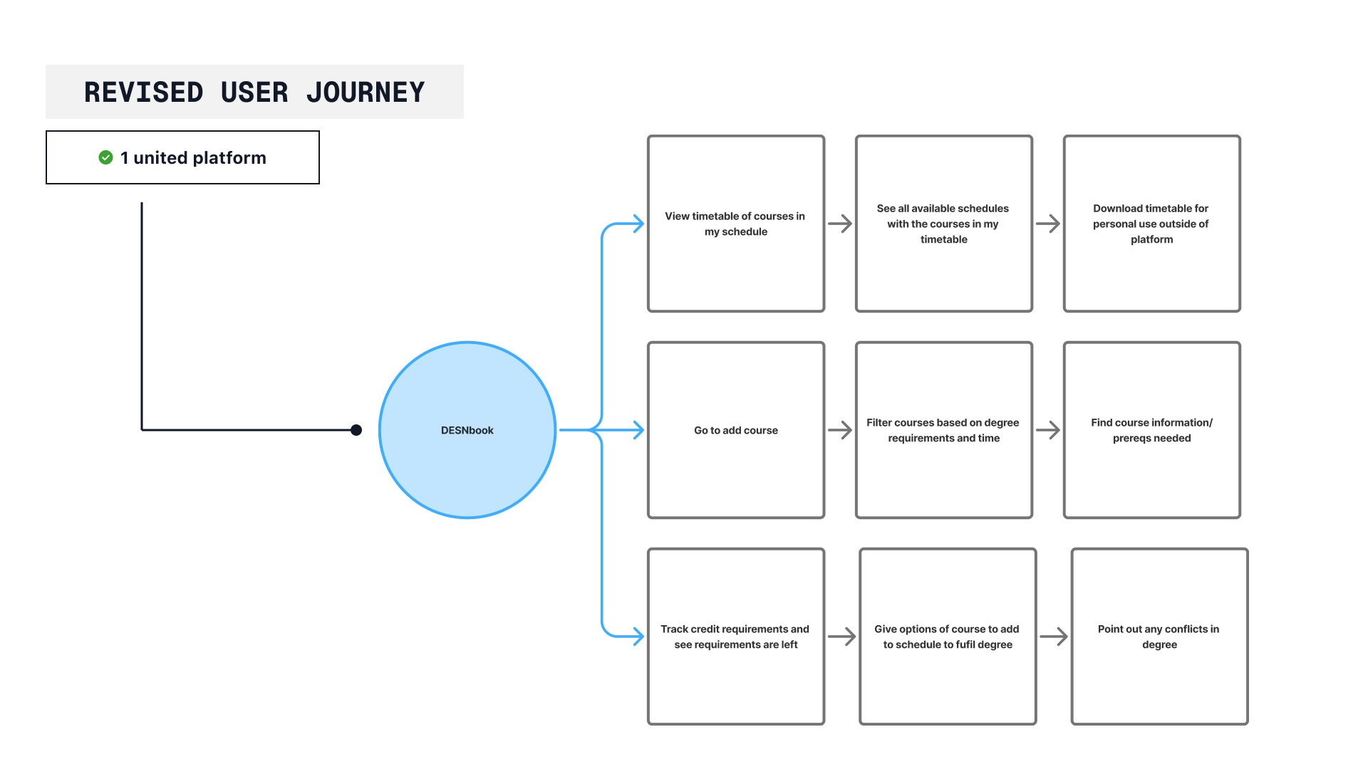
The current design journey is comprised of three separate flows- one for checking degree requirements, one for checking availability of courses, and one for plotting their timetables. This split-up system creates potential for miscommunication and a chance for students to fail to maintain degree requirements.
To fix this, the new flow should allow for students to easily change between each flow, allowing for a single experience and prevent user error.
After finalizing this new system, I could now start designing the mid-fidelity screens.
User Feedback
Mid-Fidelity to Hi-Fidelity
Based on my research, I developed a mid-fidelity prototype that addressed the revised user journey, consolidating all major flows into a single dashboard. The dashboard used a central sidebar system to allow users to navigate between their different flows, and
To test the prototype, I asked three design students who hadn't used the app to:
-
Add a course to their first-year schedule.
-
Check which credits they still needed.
-
Create a timetable for one year.
Since these three flows were most important to students, my goal was to make them as simple and intuitive as possible.
Here are the insights gained from this testing:
Design Changes
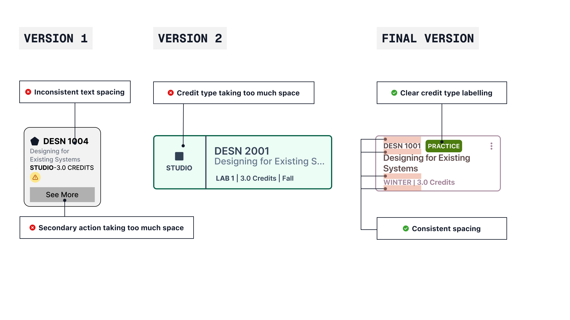
Course Card Design
User testing showed that course cards lacked clarity and essential details, such as when a course was offered. Based on feedback, I redesigned the cards with clearer organization and added labels to show which requirements each course fulfills.
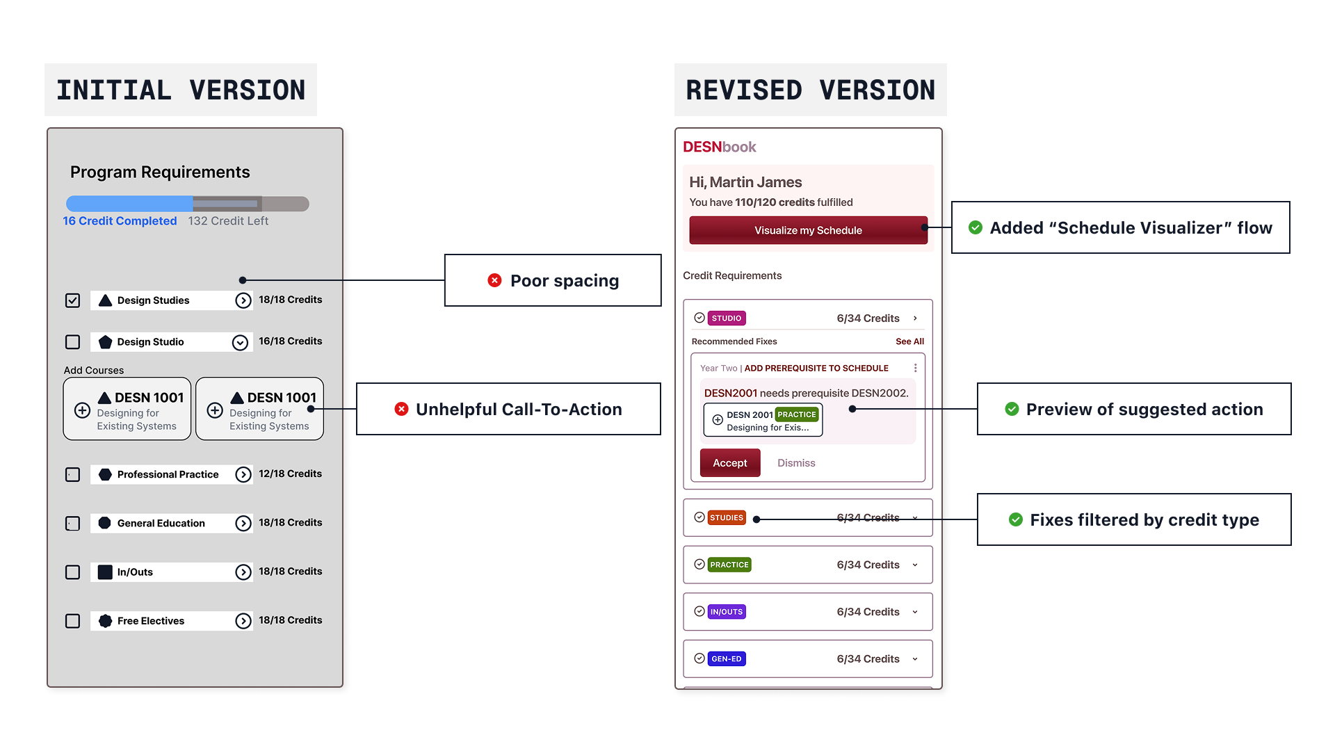
Suggestion Sidebar
Users wanted the sidebar to be more functional. Early versions displayed only credit totals without actionable suggestions. The improved version includes recommendations and quick fixes students can apply with one click.
Next Steps
Connection to Existing Platforms
Since users wouldn't transition to a new platform immediately, a sync function with existing systems would improve productivity. Making DESNbook the central hub for planning would speed up workflows and reduce human error when cross-referencing resources.
Reflection
1. Don't Reinvent the Wheel
My early designs focused on aesthetics rather than usability.
2. Data with Human Empathy
By prioritizing user journeys and incorporating feedback from real students, the final product helps students to navigate